
July 31st, 2018
Personal Finance
Real Estate
It’s not just Silicon Valley and New York that have a housing crisis. Our new maps demonstrate which metro areas across the country have the worst problems with providing affordable living spaces.
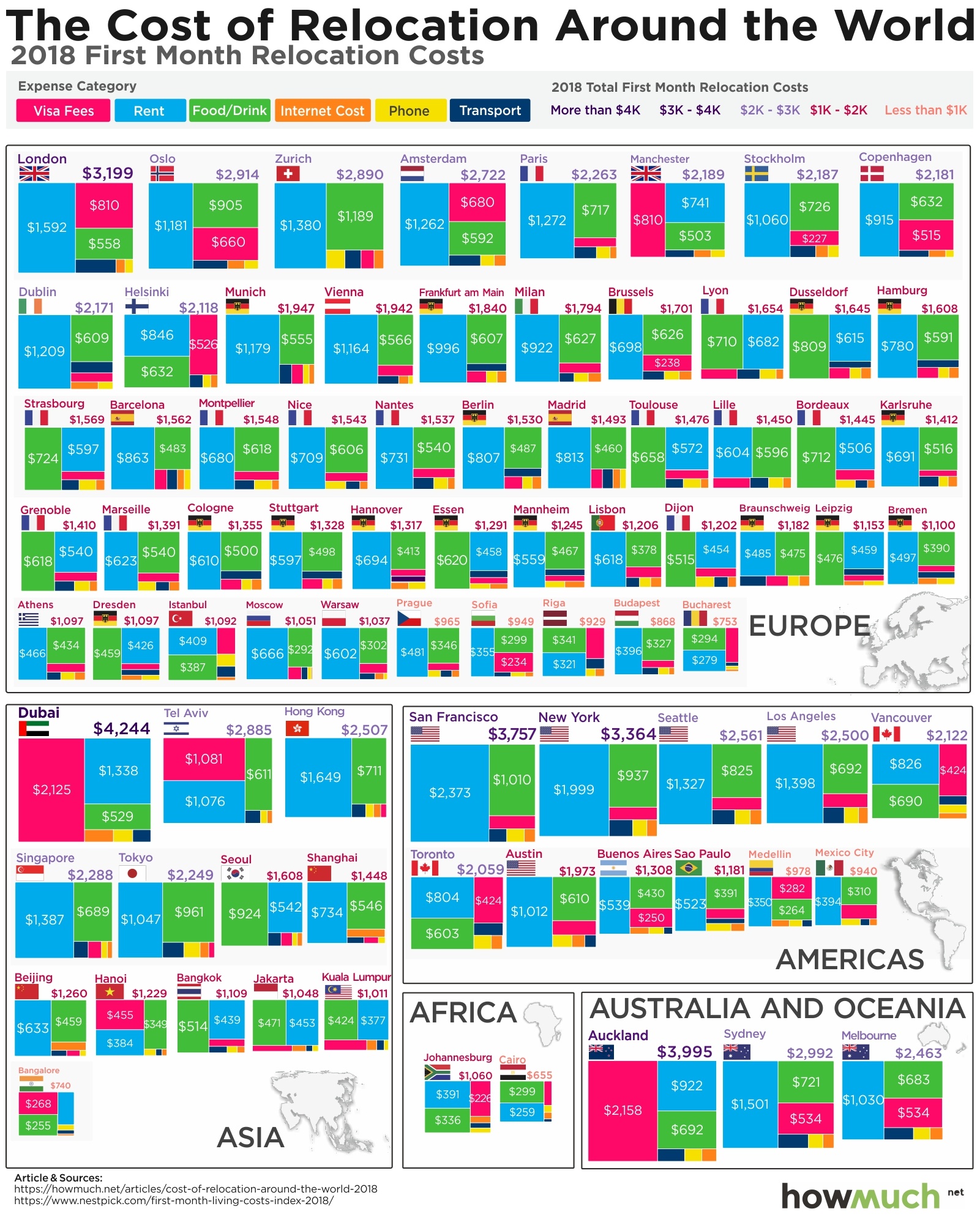
July 27th, 2018
Personal Finance
One way to accelerate your career is to move to a city with a better economy and more opportunities, but can you afford to relocate? Our visualization breaks down the costs for 80 large cities around the world.

July 27th, 2018
Personal Finance
Most people rely on Medicare for health insurance after they retire, but did you know that it won’t cover the full cost of coverage? Our new map breaks down the biggest gaps around the country

July 24th, 2018
cryptocurrencies
The sheer magnitude of how much money there is in the world can be quite staggering—and hard to understand. What if you could visualize every ma class in the world as a bubble?

July 23rd, 2018
jobs
Getting a job in the tech sector is supposed to be a surefire way to make a good living, but not every position is created equal. Our new visualization highlights the 15 best (and worst) jobs in technology today

July 16th, 2018
Personal Finance
Owning an iPhone X is a status symbol of wealth and luxury. Our latest visualization breaks down how long people must work around the world to afford one of the most expensive smartphones on the market today.

July 16th, 2018
The Economy
Spending on research and development is essential for building long term economic strength, but countries invest in R&D at radically different rates. Our latest visualization ranks which countries are on top in this critical field.
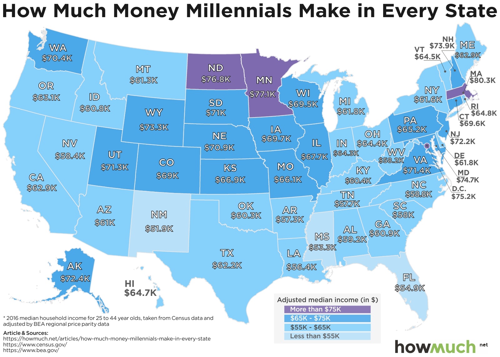
July 12th, 2018
Personal Finance
The U.S. economy is humming along, but how are millennials performing in the labor market? Our new map demonstrates how geography plays in role in determining how much young people make in their careers.

July 10th, 2018
The Economy
Everybody knows that college graduates add the most value to the economy, so why aren’t states investing in higher education at the same rates? Our new map breaks down per student funding rates for every state in the country.

July 9th, 2018
Wealth
You might think earning more money means you will save more money. Our new visualization of household wealth and disposable income across the OECD reveals that the savings equation isn’t so simple.