July 9th, 2018
cryptocurrencies
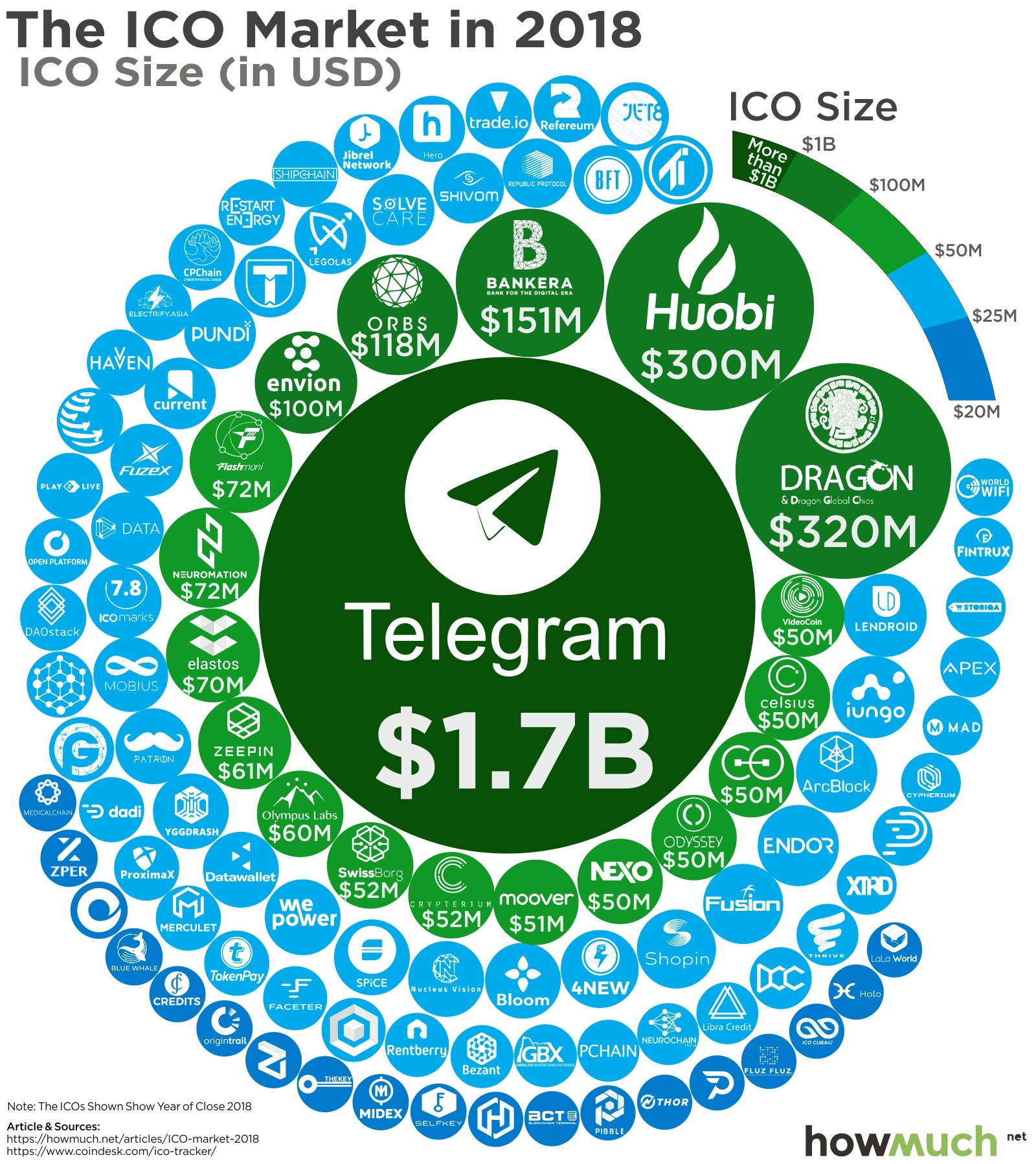
This year the ICO market has seen about 2 new entrants every single day. How can you keep track of all the activity? Our new article explores the biggest movers in the ICO market over the past year in one easy to understand visualization.
July 3rd, 2018
business
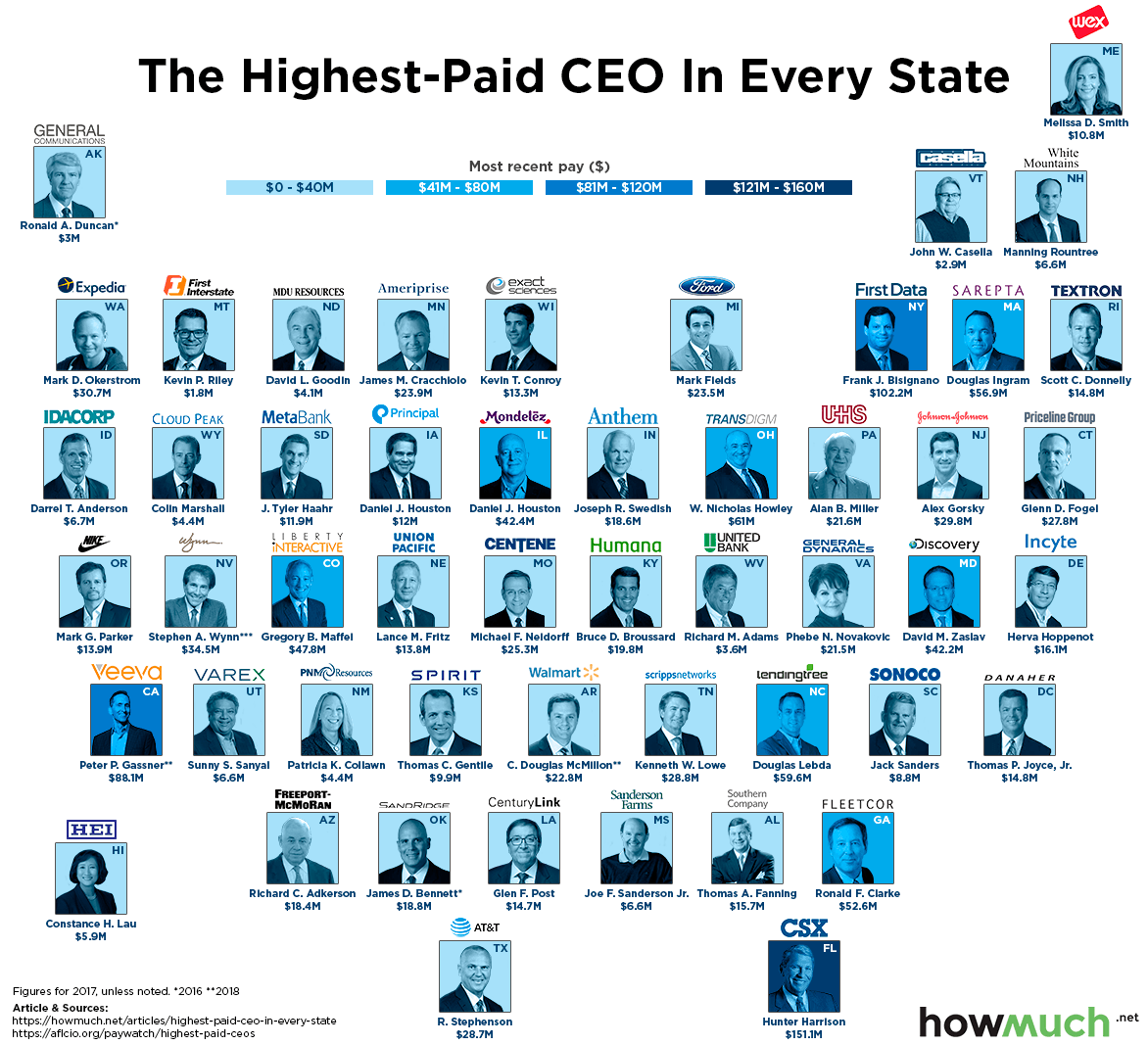
jobs
Companies pay top dollar to attract the best leaders, but did you know that geographic location influences how much CEOs make? Our new map breaks down the highest-paid CEO for every state in the country.

July 3rd, 2018
business
jobs
Want to make more money in your career? Our new map uses recently-released data to highlight the companies in every state where the average worker can expect to make the most money.
June 27th, 2018
cryptocurrencies
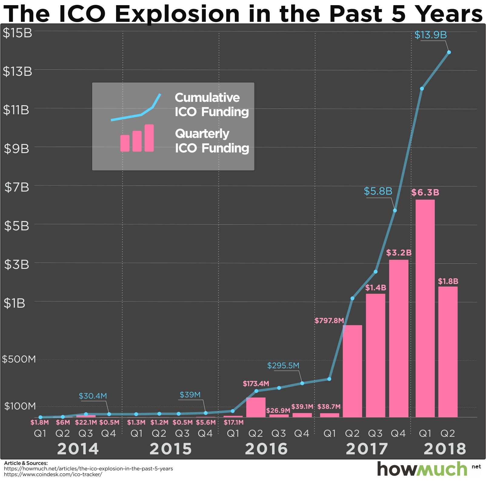
The SEC just decided that bitcoin and ether are not securities, but the regulators are still undecided on other cryptocurrencies. Our new visualization charts the skyrocketing trajectory of initial coin offerings (ICOs) in a still undefined marketplace.

June 26th, 2018
business
The best athletes in the world usually make millions, but you might be surprised to find out just how much of their income comes from endorsements. Our newest visualization reveals how the world’s 25 highest-paid athletes actually make their money.

June 20th, 2018
Personal Finance
The cost of electricity is a fixed expense in most people’s budgets, but exactly how much depends on location. Our new visualizations break down the electric utility market in two easy-to-understand maps.

June 18th, 2018
The Economy
trade
President Trump is focused on reducing the U.S. trade deficit by imposing new tariffs on specific products and goods from other countries. Our new map reveals the entire import market in one intuitive visualization.

June 15th, 2018
business
jobs
The smallest pay gaps between CEOs and average workers are still enormous. Our new visualization breaks down the 20 companies with the best pay ratios in the S&P 500, but the results aren’t exactly encouraging.

June 14th, 2018
The Economy
trade
Trump is preparing to impose tariffs on China any day now, but the U.S. could potentially have a lot to lose. Our new map demonstrates the size of the export market for every country around the world.
June 13th, 2018
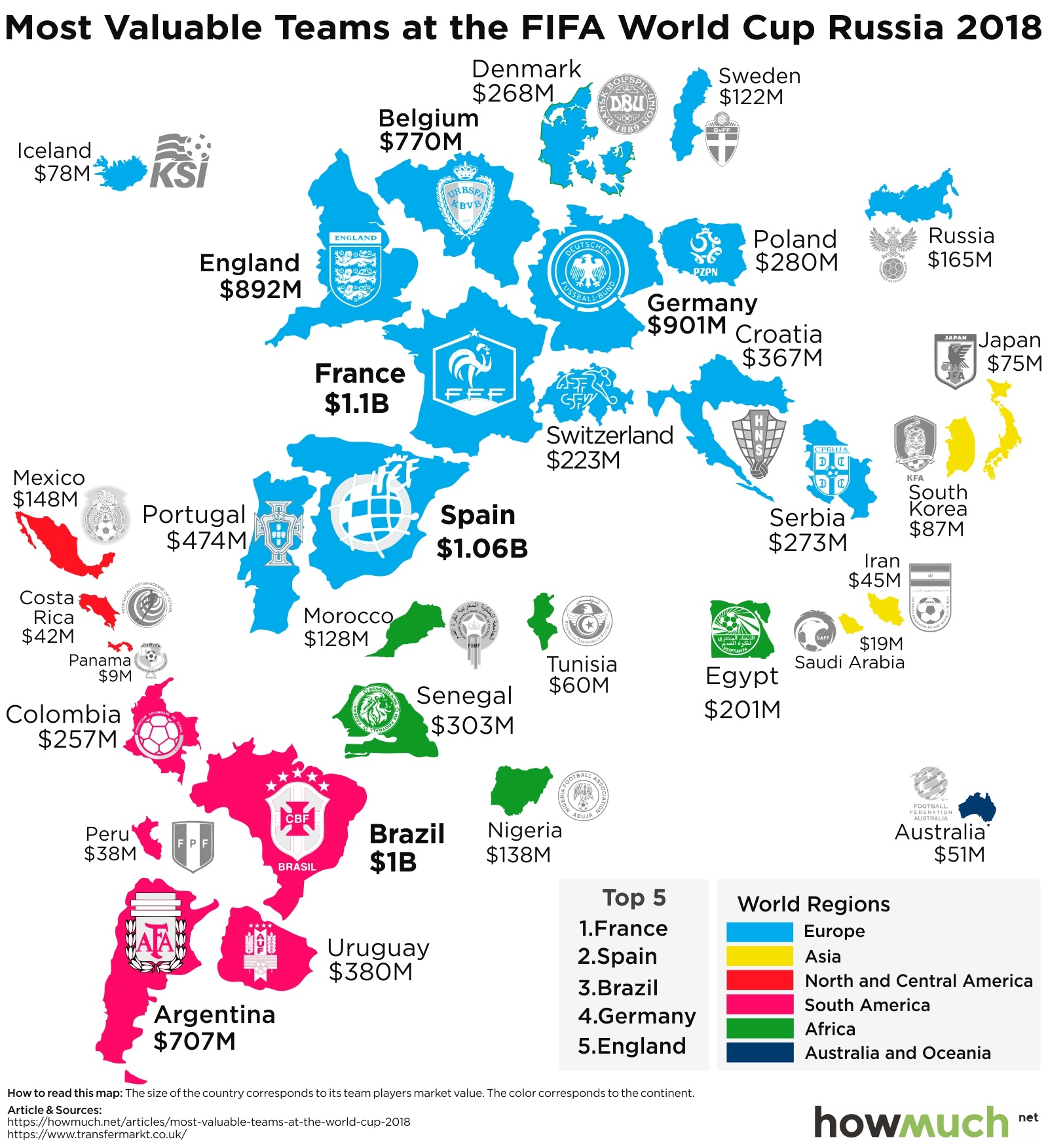
business
The World Cup is full of all-star talent, so how much is each team worth? Our new map demonstrates how the rosters of some countries have a value of well over $1 billion, while others are worth pennies on the dollar.