
August 30th, 2018
Personal Finance
The richest 1% are insanely rich, but did you know that there’s inequality even among the wealthiest people? This visualization reveals how much income is needed to crack the top 1% and the average income in that elite group

August 28th, 2018
business
trade
Most people drink coffee every single day, but do you know where that morning buzz ultimately comes from? Our new map breaks down the entire global market of coffee exports in one easy-to-understand visualization.

August 27th, 2018
Personal Finance
social-issues
Should people get paid more just because they have more experience? Our new map breaks down median income levels among different generations for each state, and Millennials are far behind their older colleagues.

August 23rd, 2018
Personal Finance
The monthly income that a family needs to be able to afford a typical rental home differs dramatically across the country. Our newest map breaks down the most (and least) expensive places to live
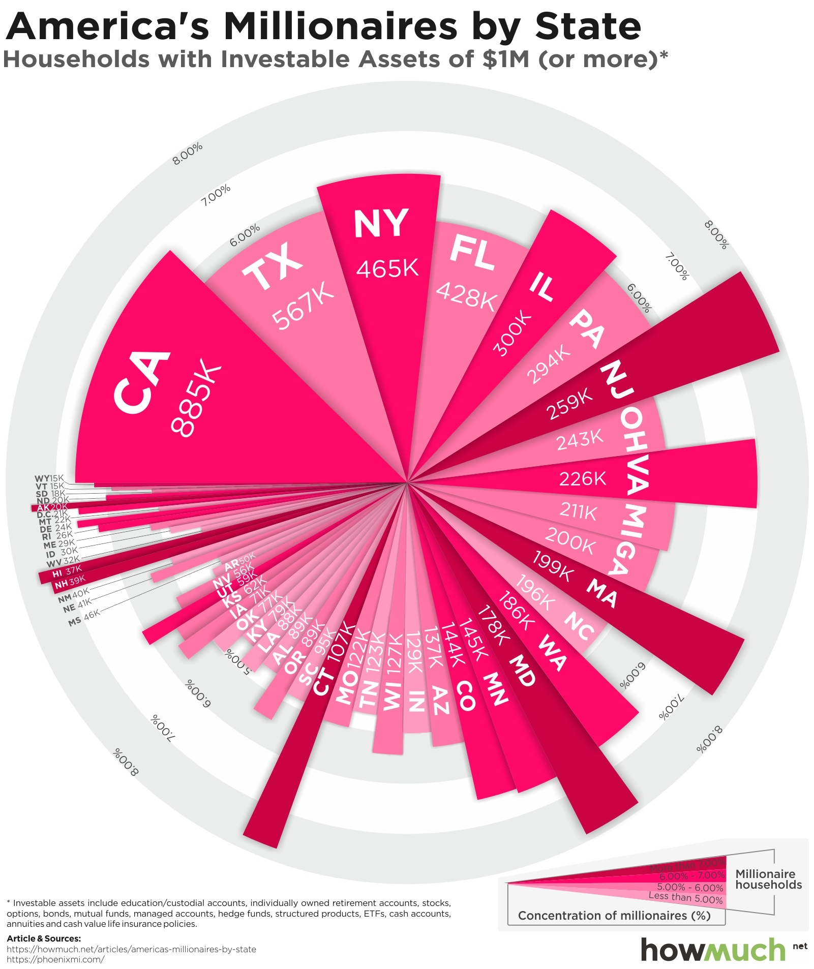
August 21st, 2018
Wealth
Most people think that to make it rich, you have to move to a big city on one of the coasts. Our newest visualization reveals a different story—there are lots of millionaires living all over the country.
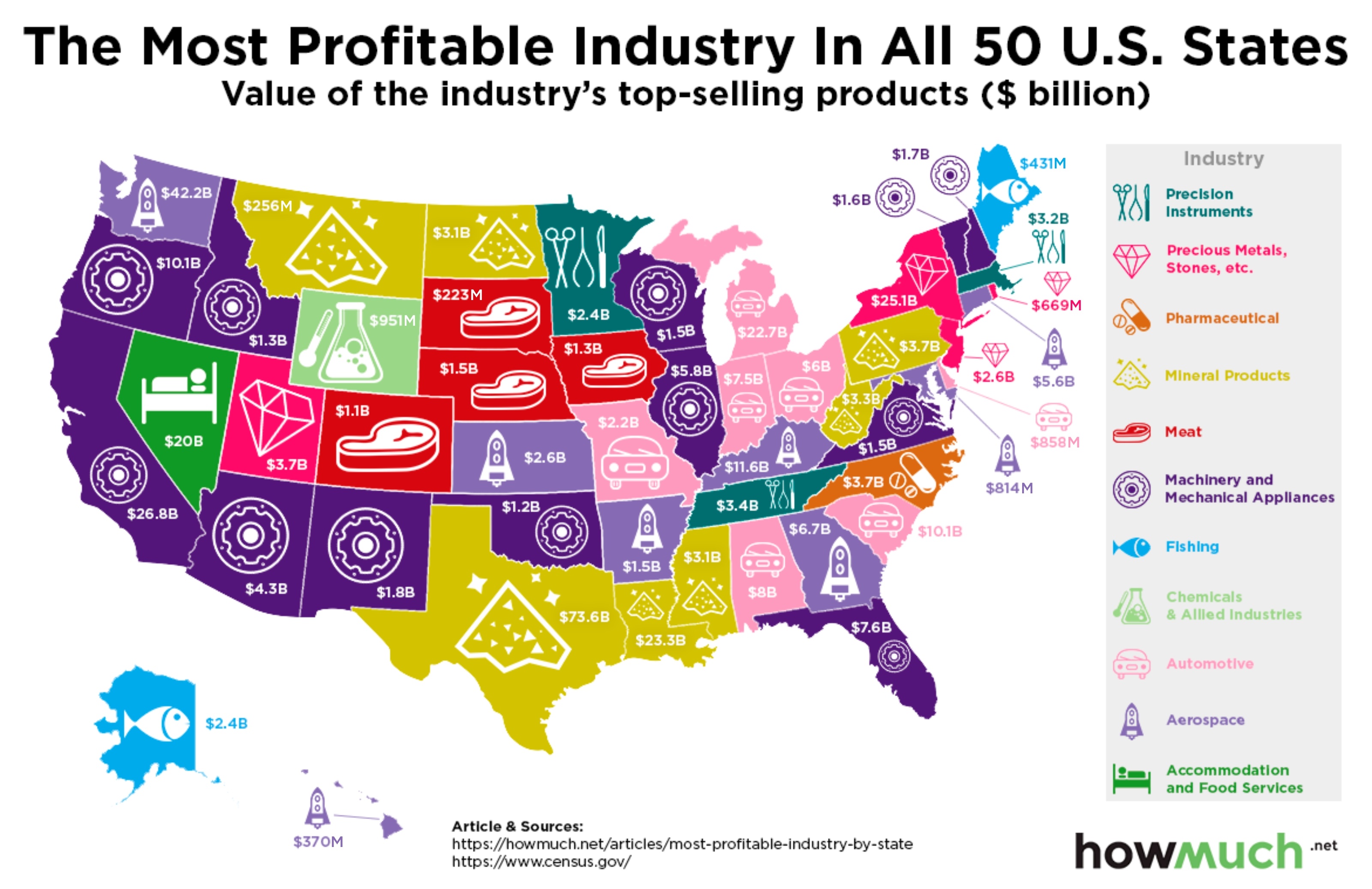
August 17th, 2018
The Economy
Texas has oil drillers, Alaska has fishermen, and Kansas has… astronauts? Our newest map breaks down the most profitable industries for every state across the country. The results might surprise you.

August 16th, 2018
Personal Finance
social-issues
Women make a lot less money than men, but did you know that going to college might actually make the gender pay gap worse? Our new visualization breaks down the schools with the biggest disparities.
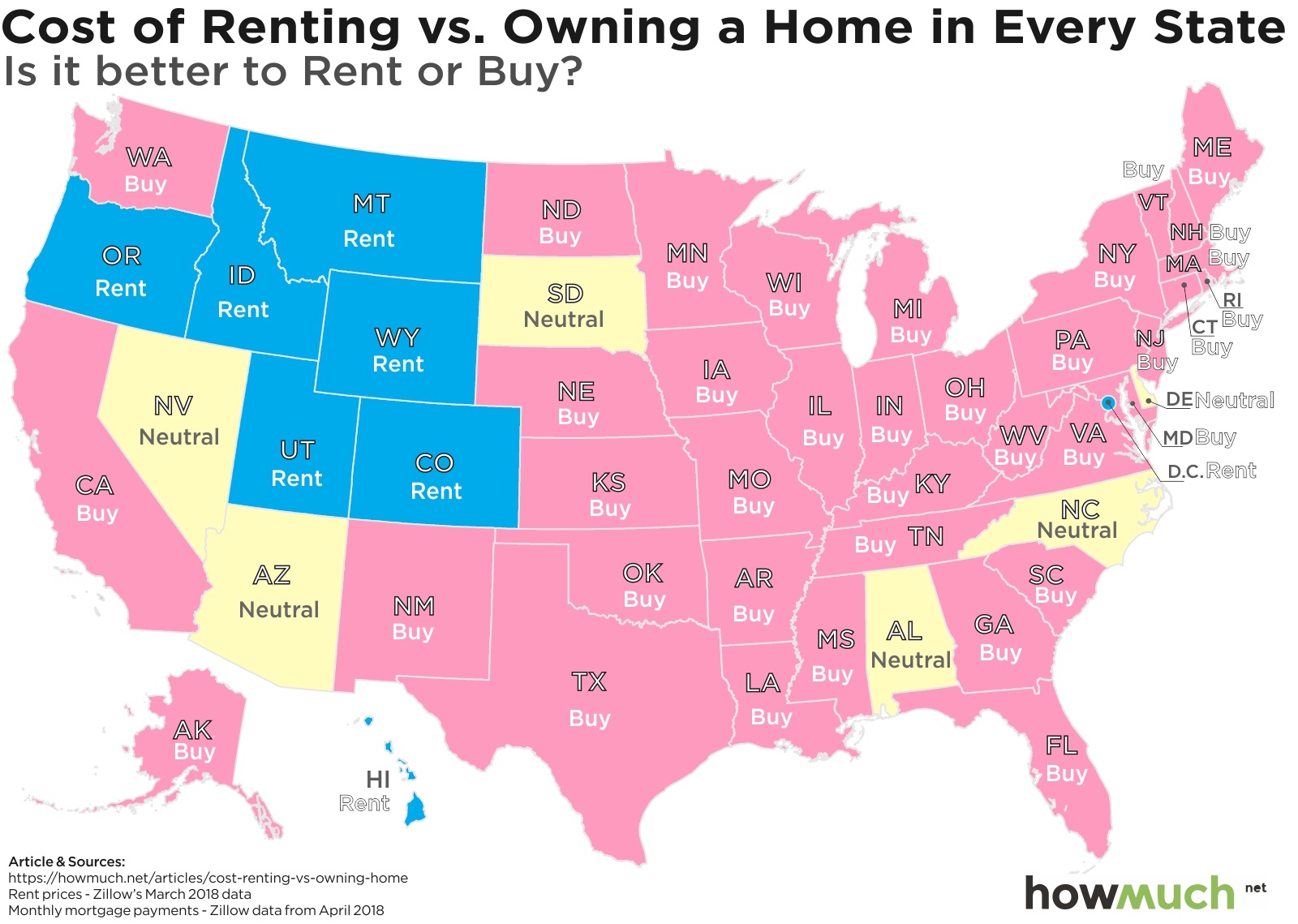
August 16th, 2018
Personal Finance
Homeowners build equity over the years, but did you know that they also save money every month compared to renters? Our new map and visualization highlight the states where it makes the most financial sense to buy a home.
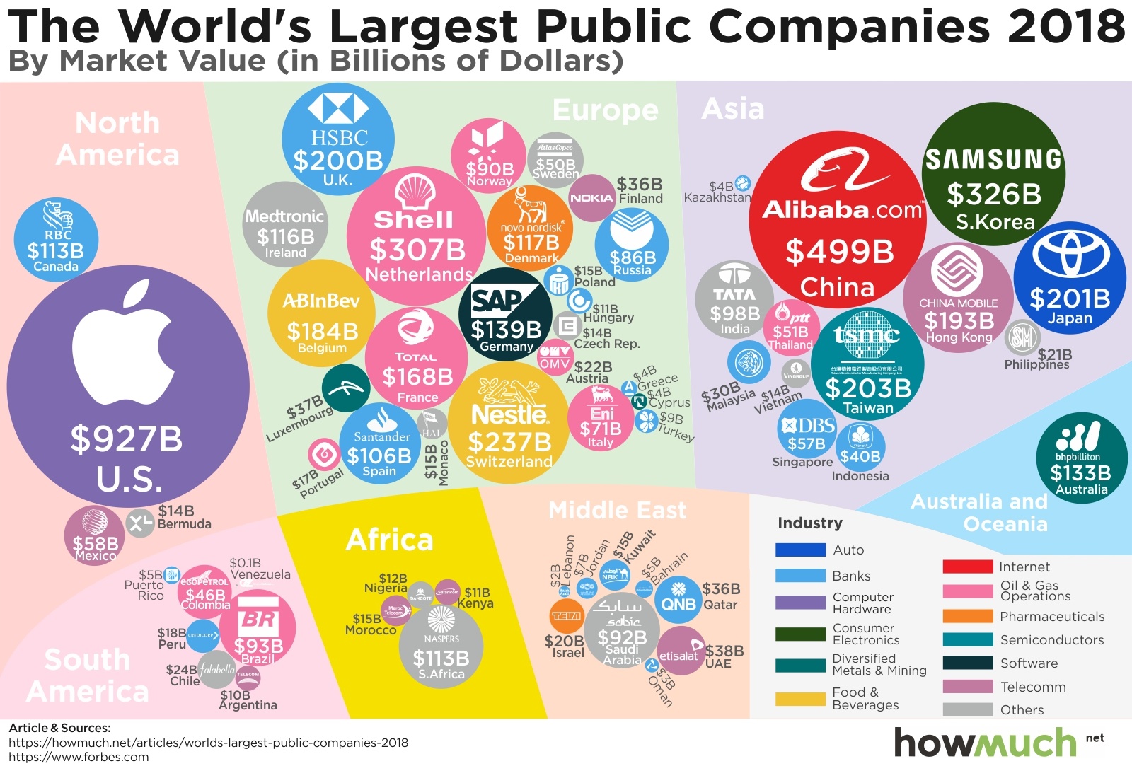
August 2nd, 2018
business
investments
Apple’s market cap is insanely high, but how does it compare to companies around the world? Our new visualization brings a fresh perspective on the most valuable companies in the global economy.

July 31st, 2018
Personal Finance
Car insurance is a smart way to protect yourself, but do you know how much it costs? Our new visualization highlights the differences between minimum and full coverage for every state in the country.