January 7th, 2020
Personal Finance
business
social-issues
Wealth
jobs
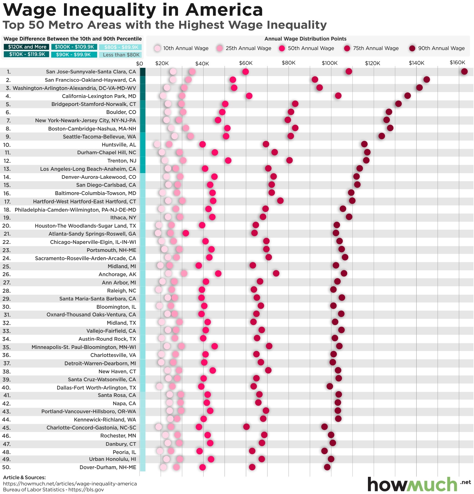
Income inequality is at an all-time high in America. This visualization breaks down the cities with the biggest gaps between high- and low-wage workers.

December 30th, 2019
Personal Finance
business
The Economy
social-issues
Wealth
What areas would you expect to drive U.S. economic output? Do more people equal more firepower, or does the location matter? Check out our county-level visualization to find out.

December 2nd, 2019
Personal Finance
social-issues
Some U.S. metro areas have a worse track record for income inequality than others

November 21st, 2019
social-issues
The U.S. puts more people in prison than any other country in the world, but some states spend a lot more on prisoners than others. See how your state compares to the rest of the country.

November 20th, 2019
Personal Finance
social-issues
Now you need more than $500,000 per year to be in the top 1% of U.S. earners.
November 6th, 2019
social-issues
Wealth
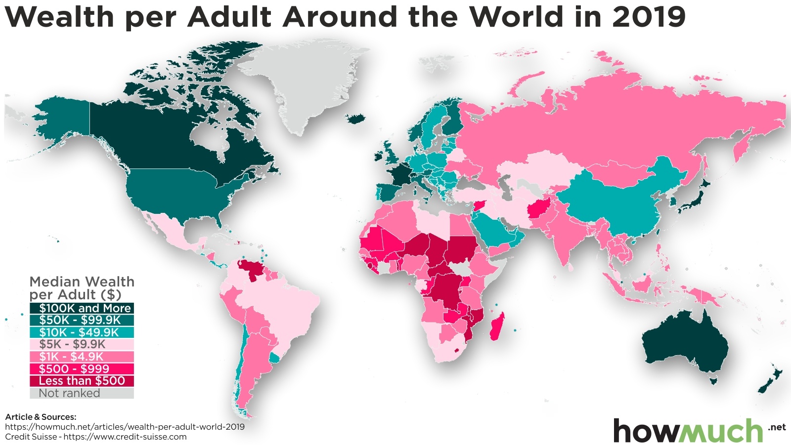
These maps show where the wealthy (and not so wealthy) live around the world

October 17th, 2019
social-issues
What’s the true cost of America’s wars? Our latest visualization captures the entire financial cost of warfare across all of Amerian history

October 15th, 2019
The Economy
social-issues
How many people are living under extreme poverty? Take a look at our new visualization to learn more.

October 7th, 2019
The Economy
social-issues
How much does the federal government spend on children? Take a look at our visualization to find out

October 2nd, 2019
The Economy
social-issues
Wealth
Which major economic events have had the greatest impact on the world’s GDP growth? Our newest visualization offers a few answers.