
January 8th, 2018
Personal Finance
The more money people make, the better their credit scores tend to be. But guess where people with the worst credit scores live?

January 3rd, 2018
cryptocurrencies
investments
Bitcoin’s market value exploded in 2017, but our new graph shows how it compares to the high-performing stocks
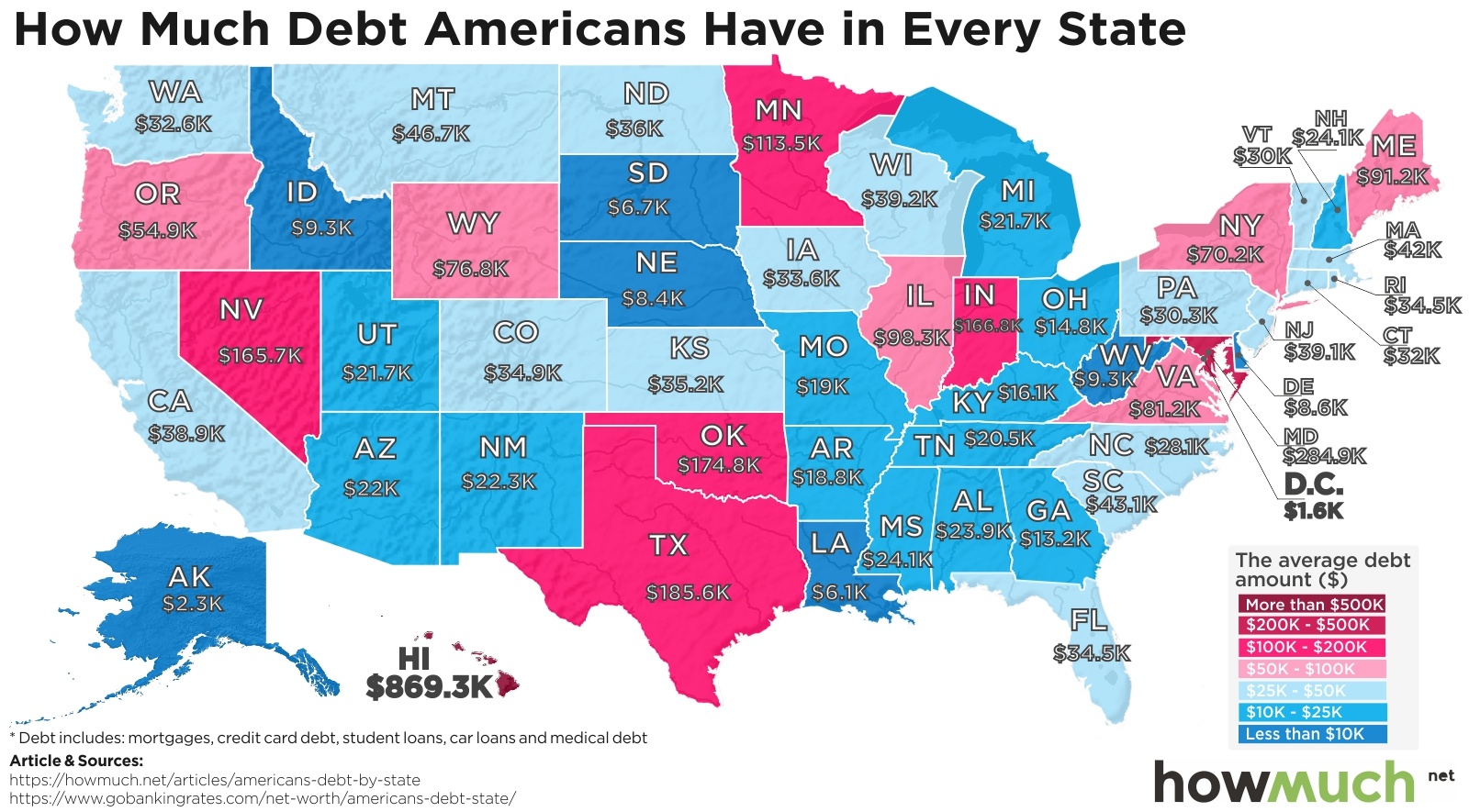
December 20th, 2017
Personal Finance
debt
Most Americans are paying off some kind of personal debt, but do you know where the people with the highest (and lowest) debt levels are?
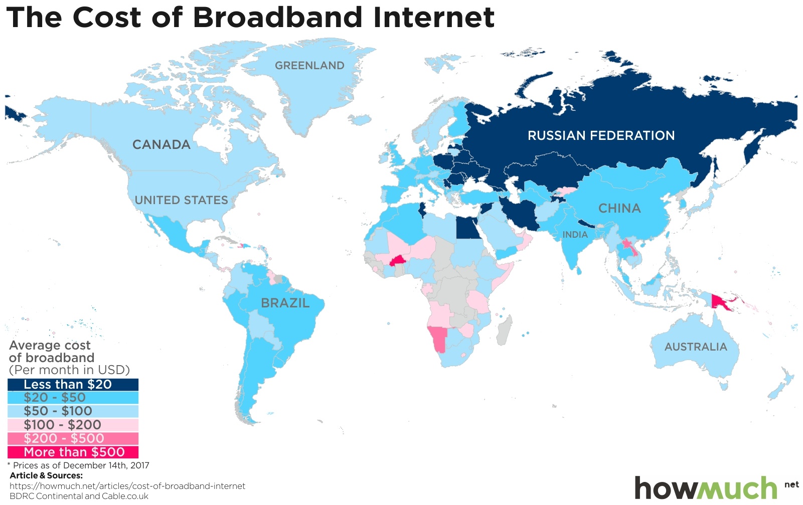
December 19th, 2017
The Economy
According to the U.N., internet access is now a human right. But how much should it cost? We mapped broadband costs worldwide to see where internet is cheapest - and the results will surprise you.

December 19th, 2017
Personal Finance
Our new map breaks down personal consumption patterns for every state, showing you the most expensive and cheapest places to live in the country.

December 12th, 2017
Wealth
There are 34 states with Republicans as their richest politicians, 15 with Democrats, and one with an Independent. Interestingly, every single one is in Congress. Who’s the richest in your state?

December 11th, 2017
The Economy
social-issues
There’s isn’t an exact correlation, but our new maps show that the more economic freedom people have, the more likely they are to live in a strong economy.

December 5th, 2017
Personal Finance
Millennials can get priced out of the housing market too, just like everyone else.

December 4th, 2017
Personal Finance
social-issues
The government sends billions of dollars overseas each year, but do you know where the money goes?

November 30th, 2017
The Economy
trade
Have you ever wondered where your medicine comes from? This map shows the value of global drug and medicine exports, and revealed some shocking observations.