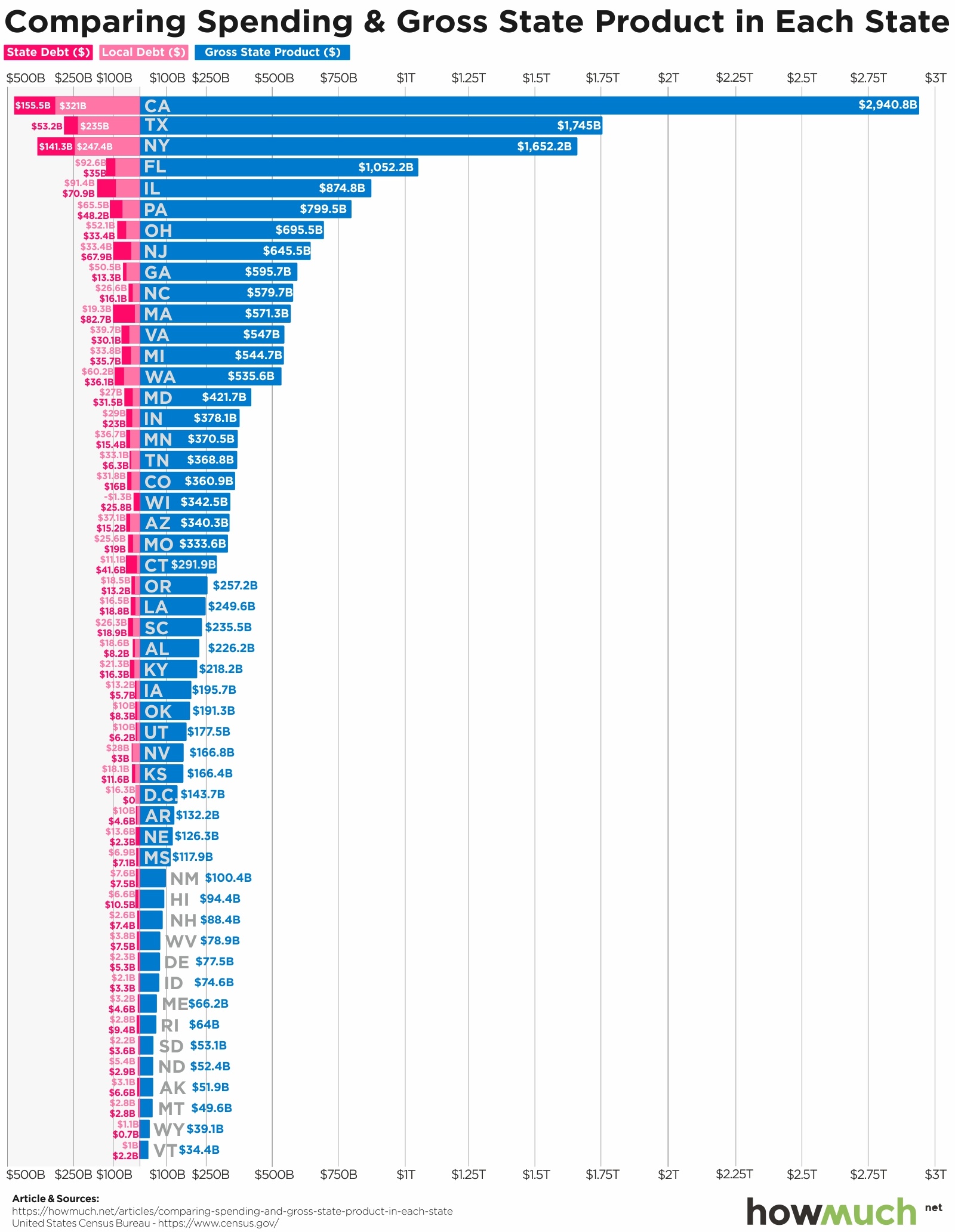
March 21st, 2019
The Economy
debt
Our latest visualization uses data from the U.S. Census Bureau to compare each U.S. state’s debt to its output

March 13th, 2019
The Economy
The economies of these nations fit like puzzle pieces inside this map of America.

February 26th, 2019
The Economy
taxes
Our visualization shows how much money the federal government collects and allocates back to projects in each state, revealing who is shouldering more of their fair share of the tax burden, and who is taking a free ride

February 21st, 2019
The Economy
social-issues
President Trump frequently criticizes how little money other countries spend on global institutions like the UN. Our visualization lets you compare American financial support for the UN with the rest of the world

February 6th, 2019
The Economy
jobs
Trump and Obama both claim credit for a strong economy and high job growth numbers. Our visualization shows you the real track record of job growth for each president going all the way back to the Great Depression.
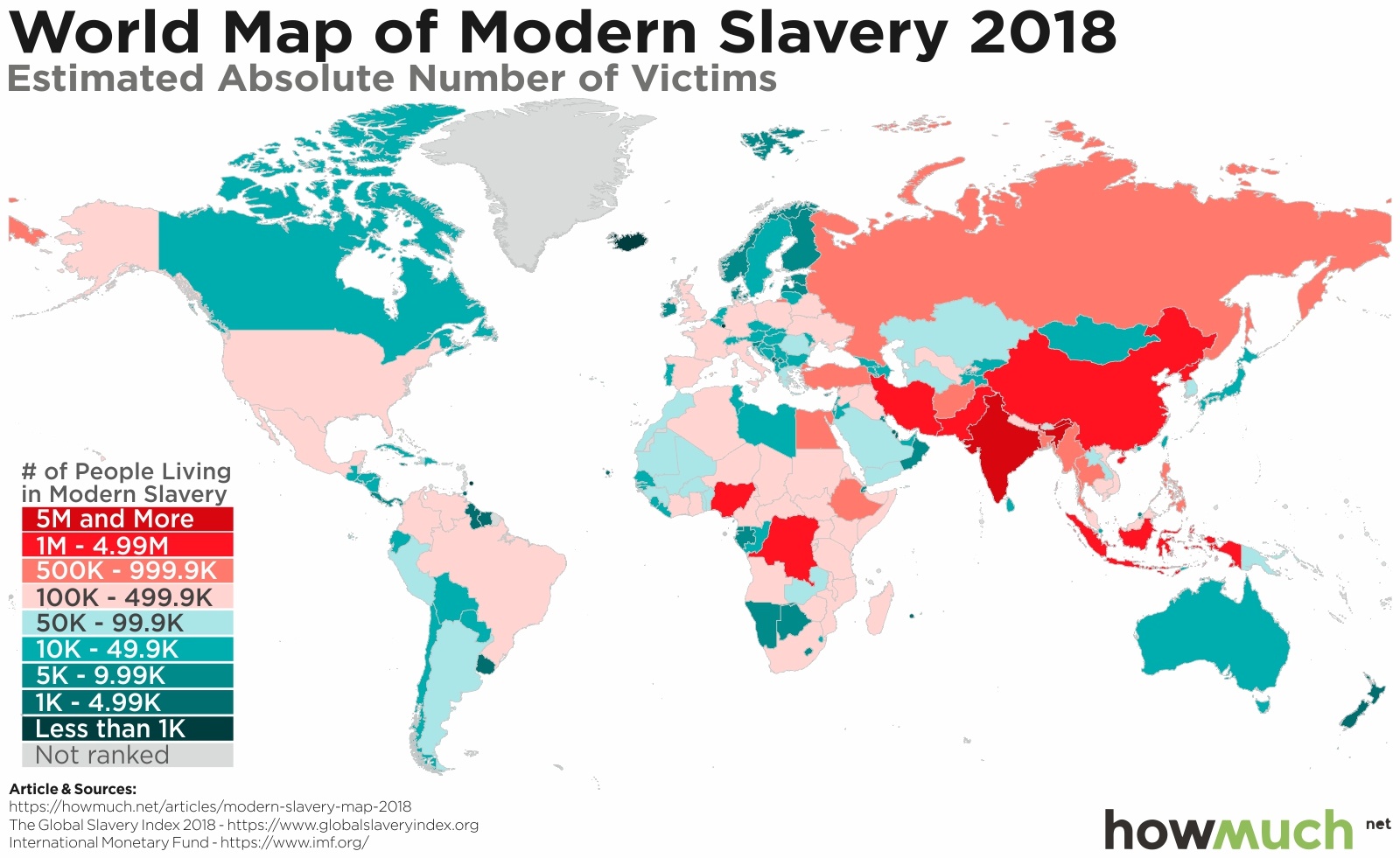
January 31st, 2019
The Economy
social-issues
Slavery is any type of system that forces people to be treated like property, including forced marriage, labor and human trafficking. Our maps shed light on the true extent modern-day slavery around the world today.

January 28th, 2019
The Economy
The U.S. economy is constantly changing. We track the percentage increases and decreases of every major expenditure affecting your life for the past 20 years.

January 22nd, 2019
The Economy
investments
Foreign direct investment declined in the last several months as the global economy slowed and trade wars heated up. But the U.S. and China still lead the world as overseas capital looks for investment opportunities.
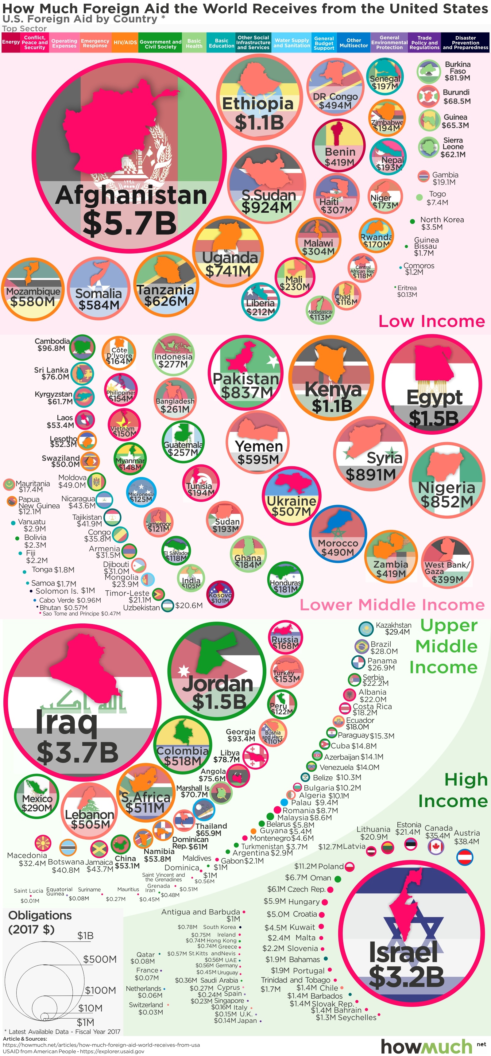
January 14th, 2019
The Economy
social-issues
President Trump constantly threatens to cut foreign aid, but he hasn’t changed much over the last 2 years. Our visualization breaks down the countries and issues continuing to receive money during Trump's administration.

January 11th, 2019
The Economy
The best way to compare economies between vastly different sized countries if GDP per capita. Our new series of maps provide a snapshot of the enormous inequality around the world in a true apples-to-apples comparison.